GNOME Shell Is Finally Improving its Search Results Page
Search results in the GNOME Shell overview may soon look a little neater.
Improvements to the look and layout of the GNOME Shell search list is being worked on as part of this year’s Google Summer of Code.
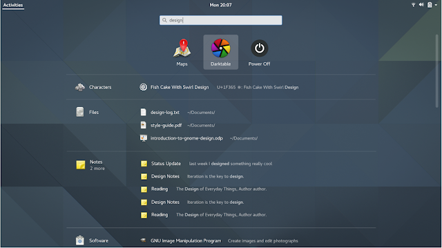
The updated design, to be based off of a GNOME design team mockup from 2015, makes better use of space, provides more information for local file and folder results, and uses smaller application/result icons to make the list easier to scan.
Rares Visalom, writing on his blog, says :
This post, GNOME Shell Is Finally Improving its Search Results Page, was written by Joey Sneddon and first appeared on OMG! Ubuntu!. Read More : Source Article
Improvements to the look and layout of the GNOME Shell search list is being worked on as part of this year’s Google Summer of Code.
The updated design, to be based off of a GNOME design team mockup from 2015, makes better use of space, provides more information for local file and folder results, and uses smaller application/result icons to make the list easier to scan.
Rares Visalom, writing on his blog, says :
“I’m working on is this bug and I can happily say that it’s nearly done. A few minor adjustments and it will look just like in the picture.”“There are still some questions about adding transitions (but nothing sure so far) and that’s about it. I’m going to write another post soon, when the search results will look exactly like the mockup!”
This post, GNOME Shell Is Finally Improving its Search Results Page, was written by Joey Sneddon and first appeared on OMG! Ubuntu!. Read More : Source Article


No comments: